Evolving Diversability's Brand Identity
By Tiffany Yu, CEO & Founder, Diversability (with guidance from Mariya Leona Illarionova)
Today, we’re excited to share Diversability’s new brand identity. As we continue to advocate for more intersectional disability representation, our new branding allows us to showcase how we feel about ourselves and our disability community: friendly, bold, inclusive, capable, powerful, and fun.
I founded Diversability in 2009 because community is what I so desperately needed as a young disabled person who often felt isolated, lonely, and excluded in my experience. I wanted to create a place where disability was the reason to belong, not a reason to exclude. Diversability is not only where I found my voice, but it is also through this community that I became proud of my disability identity and started my own journey of unlearning my own internalized ableism.
In 2021, almost 12 years later, I still believe that when we share our disability lived experiences, we build authentic relationships with each other and leverage the power of our collective influence to positively reframe the disability narrative. Today, we are positioned as a leadership collective that elevates disability pride through community, visibility, and engaged allyship.
For this process, we hired Wild Side Studio, a disability-owned design studio that empowers communities through strategic branding & artistic visuals. The studio was founded by Diversability community member Mariya Leona Illarionova, a multidisciplinary artist and community strategist passionate about the intersection between intelligent design, community, and psychology.
Making a statement

Diversability’s logo since 2009. “Diversability” in thin block text with “ability” highlighted.

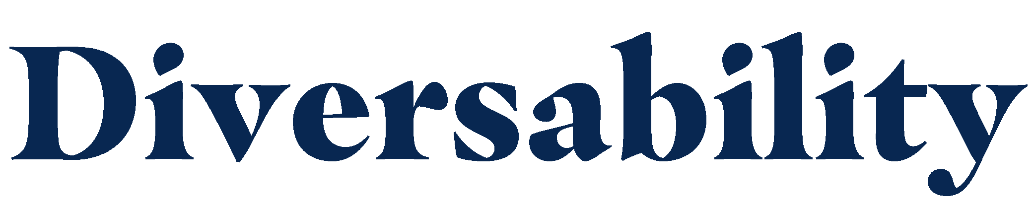
Diversability’s 2021 logo. “Diversability” in navy.
Our logo for the past 12 years was designed by my friend and Georgetown classmate Wei-Yin Lin.
Our brand is called Diversability because we believe that disability is diverse and that disability is diversity. We are not a monolith. As per the National Center on Disability and Journalism guidelines, we suggest using Diversability only when referencing our brand and want to encourage our community and allies to use the word disability when referencing disability (learn more through Lawrence Carter-Long’s #SayTheWord).
We felt that highlighting “ability” in our logo was outdated and perpetuated disability stigma. We come back to the ableist trope, “Know me for my abilities, not my disability.” As we’ve learned over the years, someone’s disabilities don’t have much to do with their abilities (or capabilities). And what if you know us for our disabilities AND our abilities, not as characteristics that are mutually exclusive? We are proud of our disability experience and did not want to diminish our disabilities in our logo.

Diversability’s 2021 symbol. A gradient light to navy blue capital “D” with a diagonal upward line.
Our new symbol is a capital “D” with a diagonal line through it. The line represents the elevation of pride within the disability community. Like us, it’s bold and makes a statement.
Colors that reflect our personality and access

Circles of varying sizes and colors of blues and orange shades.
Our colors are curated for personality, contrast, and accessibility.
According to market research, blue communicates trust and reliability, similar to how we view the disability community. Orange as the primary color pop expresses boldness, friendliness, power, and fun, while also adding warmth and energy to our message.
Our updated colors feature high contrast, which makes it more accessible for those with color blindness or vision-related disabilities. They also include gradients for added depth and dimension, which communicate in alignment with Diversability’s work to move forward toward a more equitablle and accessible world.
Accessible fonts
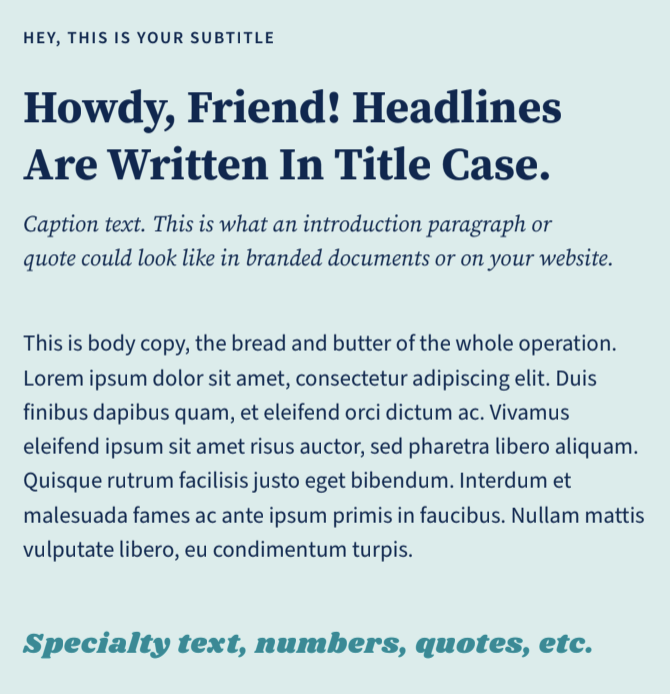
5 different font styles on a sky blue background: 1. a small block subtitle text, 2. a large bold Serif title font, 3. Italicized caption text, 4. Body text, and 5. a bold & italicized accent font.
The Source Sans & Serif Font family were selected because they are quality open source typefaces rooted in UX and accessibility. The fonts are intentionally designed to be used for digital mediums. Because of this, the letter shapes are simplified and highly readable, making it a great font for dyslexic readers. The close companionship of Serif and Sans is achieved by a careful match of letter proportions and typographic color.
The Source Serif typeface has a bold character of its own and shines when used for text on paper or screen.
Source Sans Pro provides highly readable body text. The font's slender but open letters offer clean and friendly vibes. Unlike many Sans Serif fonts in the market, this font passes the dyslexia font test by having idiosyncratic differences in the following letters: I, i, L, l, 1.
Celebrating diversity

Rectangular graphic with text in white on a navy gradient background, “Elevating disability pride, together.” On the right, a photo of 5 speakers from a Diversability event.
And while it is exciting for us to share our updated logos, colors, and fonts, our brand comes to life through the experiences of our Diversability community members from around the world, not only in the genuine connections created through our community and events, but also through the D-30 Disability Impact List and our broader global digital footprint. While our stories are unique, we share a common commitment to disability inclusion.
Elevating disability pride, together
When I started Diversability, my original premise was that I wanted to create a movement to celebrate disability pride. When Diversability relaunched in 2015, our tagline was “rebranding disability through the power of community.” Most recently, it was “amplifying disabled voices.” After discussing with our community, we were reminded of the power of language to empower or disempower our community and decided to return to our initial vision of “elevating disability pride, together.”
We are proud to be disabled.
While “disability pride” is not a new concept (check out our Instagram guide on it), consciousness around it is. In an ableist society, we know that our pride and visibility is a form of activism. And through our work over the years, our biggest wins have been celebrating our community members who have been empowered to take pride in and ownership of their disability identity and disability narrative.
As we ease our community into our new brand experience across our channels and platform, we want to continue to celebrate our Diversability community, our non-disabled allies, and our partners for joining us in elevating disability pride, together.